The true size of…
If you take a look at the world map, some countries appear to be the same size, but in reality the distance varies greatly. On the website The True Size Of… they show you the real size of each country. You can compare how big or small one country really is compared to another (and that’s incredibly fun to play!). How big is the United States compared to Australia? And what about Europe? Your picture of the world will never be the same again!
United States vs. Australia
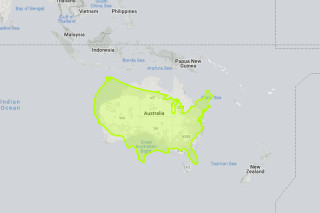
Take, for example, Australia – we have learned that this continent is huge, but if you look at the traditional world map, it is quite difficult to imagine. We have compared the United States (minus Alaska and Hawaii) with Australia. They are practically the same size!
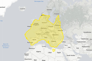
If you compare Australia to Europe… Wow! Australia just got a lot bigger than it appears on the traditional world map. Try it yourself. You may be surprised at what you find!
The traditional world map
With The True Size Of… you will realize that the widely accepted traditional world map (you probably have one at home) is not the correct one! For example, Greenland looks much bigger than the United States, but as you can see below, it’s not like that at all. This also applies to Russia, which of course is a large country, but in reality it is as large as the north of the African continent and that part of the world appears much smaller on the traditional map.

This is quite simple to explain: in 1596 the Mercator projection was developed for sailors to navigate. This is the traditional map you see everywhere. Since the Earth is round (yes, flat earthers, it’s round; not flat), it’s almost impossible to develop a map on a flat surface, without the countries changing shape. That is why Greenland is so spread out and Antarctica looks like a huge continent on the Mercator projection world map.
A Japanese artist from a geometric design company recently designed a world map on a flat surface, very, very close to reality.


